Specified and Target Goal
Design Promotions: Commercial outdoor billboard
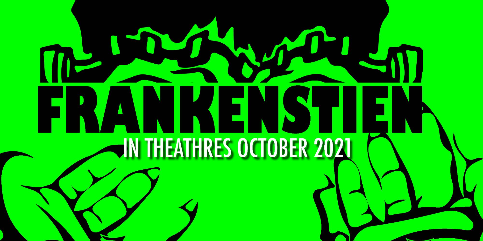
Target Audience: I wanted to keep my target audience very similar to the last renditions of my project which were youngsters and teens who enjoy storytelling. I feel my work captures a good sense of the main character which the target audience is so well known to.

Working with the digital rough in Indesign I just felt there were many things I could do to improve and progress towards the final design. I felt this rough was way too clustered and the font paring with the design didn’t work well in this instance. Incorporating the Frankenstein hands in the design also gave me some sense of using negative space in my project a little more freely. I had too many components and the promotional ads I chose to do required better legibility. On my billboard I definitely executed better use of space and I though just looked much improved the same font Gill Sans worked well on a larger project and Futura worked well with my instagram post. Doing the final renditions and making the mockups really helped me realize that the changes were working and effective to their respective outcome. All in all this was very fun as my mockups reminded me sometimes of the very own Monster stories I use to read as a kid and how design and typographic execution can bring something to life.